
Saturday, June 28, 2014
Parisian Corner Building

First the French taxed real estate based on the number of rooms but attic rooms were not counted. Builders started making Mansard roofs to create more untaxed rooms. The French government (Parisian?) then started taxing the rooms behind Mansard roofs. Eventually the builders responded by making Faux-Mansard roofs; for people liked the look of Mansards but it was cheaper to make boxy buildings with a fake slant of roof atop.
In the same way, at one time the French levied real estate based on closets. The people responded with armoires.
I assume all this is true. My old boss and real estate appraiser, James Mason, told me these facts.
I like the way LARGE words were sometimes painted on French buildings of Atget's time.

Sunday, June 22, 2014

Saturday, June 7, 2014

Wednesday, June 4, 2014
I Foolishly Redesign the Japanese Flag.

The Japanese flag is a red circle on white. Simple and elegant. It is reflects the Japanese red crowned crane, (see below), which is mostly white with that same red accent. It has been described as the perfect flag.
But if you followed the hearts of the Japanese people, their flag would have a spring-green circle instead. The Japanese are simply obsessed with this color.

Above image from nejohnston.org
Saturday, May 10, 2014

Wednesday, April 30, 2014


Thursday, January 23, 2014
Tale of the Uninherited Prince


Now, don't you want to read more of this story? No, no, not the Lorem Ipsum part, of course.
This artwork was inspired by the Descriptions of Holy Cities, which are Islamic graphic-layouts of various cities, stylized and labeled. They are bound in small, Beatrix Potter sized books. The Met Museum has two of these which I regularly go to peer at. The museum opens them to different pages from time to time.
Tuesday, January 7, 2014

Saturday, December 21, 2013
Orcherstrated Cloud Progressions


Sunday, December 1, 2013
Stove Bird

My grandmother had an old fashioned stove, on the front was a small graphic of a chick hurrying out of it's shell.
Tuesday, November 26, 2013

My Designs for Punctuation Marks

It could have a Bold function which would allow the typist to choose which specific letters and marks are termitted. An alternatively holed type would be accessed through the Italic function. This would give a varied and more natural look to the text.

Monday, November 25, 2013

Sunday, November 24, 2013
Retro-Futura

A modern yet retro look. I should move the first u over to the left a smidgen but I am just dedicating an hour or so to this project from concept to execution and posting. Perhaps I should align a couple other things too but I actually like the imperfections. Only the small case t and r are bespoke.
Thursday, November 21, 2013

Friday, November 15, 2013
Artwork Derived From the Design Elements in the Previous Post
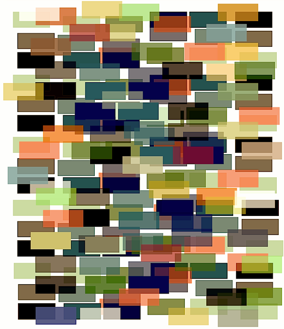
If you click on the above image, you will be transported to a subtle animation, (for you students at Hogwarts, it's like a portkey). However, it was made in Flash and will not work on muggle mobile devices, only muggle computers. To quote Professor Gilderoy Lockheart, "It's like magic!"
Read my previous post for the story of why I had to make this all by myself.
I was once in the Wildenstein Gallery when they were talking about a Nevelson sculpture which hung on the wall. It was upside down and had just been sold. They pondered if they should tell the buyer.
You can click the below picture to see a nice version of my faux-painting set in a pleasing white/negative space. But I'm not going to tell you that it's hung sideways in case that's the way you like it... Oops!

Wednesday, November 13, 2013
My Representation of Molecules Showing the Number of Protons in Each Element


This is just a quick idea of how to represent molecules/atoms so that people especially students can easily get a feel for what the atoms/molecules actually are.
Saturday, November 9, 2013

Wednesday, November 6, 2013

Friday, October 25, 2013
A Mute Machine for Playing John Cage's "Silence"

That performance necessitated my invention of the Theremin 4'33, a mute machine but it uses batteries for the on/off light. (You should look up Leon Theremin for fun.)
Sunday, October 13, 2013

Wednesday, October 9, 2013
Quick Study of a Very-Imaginary Bug

I was casually counting the number of wild bee and bumblebee species (subspecies?) in a left-wild and weedy corner of central park. One small bee had the shiny metallic-green you see on some common flies. A jewel.
That inspired me to invent this drawing, it was done entirely in Mac Pages, not Adobe or drawn by hand.
Tuesday, October 8, 2013

Saturday, September 14, 2013
A Cake Recipe from 1956

My mother kept a pamphlet cookbook for cakes in the bottom drawer. I don't think she ever made one from it though we were treated to a homemade desert most nights.
When I needed to make some cartoon hearts earlier today, I thought of it. Here's why.
The pamphlet had recipes for only 12 cakes, one themed for each month. It was not the baking instructions, whether the cakes were devil's food or crammed with lemon cream, it was the fun shapes that made them special.
The lamb cake it featured for April was covered with Baker's shredded coconut with halved black jelly beans for eyes and a half red one for the nose. We found it waiting on a side table each Easter at my grandmother's house. (I doubt the lamb actually was in the booklet, probably not, it was a mold cake? I might be mixing up my memories. I was guessing it was the April page.)
In October you were supposed to make a witch's head cake, a flag was for the fourth of July, but February's concoction was simply the cleverest of them all. It was a Valentine heart.
Just bake one circular cake and one square cake of the same size (circle diameter = square side). Then cut the round into half and put the pieces together. Frost it up nicely and your sweetheart will think you're half a magician.

The fun cover.

My favorite from their other cake pamphlet of Animal Cakes. And below, how it was done.

Friday, August 2, 2013
An Elegant Witch's Hat House

I grew up on Eastern Long Island where we could drive by a roadside, cement teepee which sold souvenirs from the local Shinnecock Indians. It was not too different from this. And we had the Big Duck, which everybody loved. It's still there. You used to be able to buy Long Island ducks inside. Nowadays? I wonder what it sells?

At one point, they moved the duck down the road about a mile. I had wished that they painted duck footprints between the locations.
Big Duck and maiden-not-in-distress photo from preservationinpink.wordpress.com/2008/11/26/the-big-duck
Monday, July 29, 2013
A History Lesson
Certain Beheadings were looked forward to with more fervor and anticipation than others. For example, the guillotining of Lady Uxley, inventor of the coffee filter, did not occasion an overly popular event.

HOWEVER, the beheading of her dear cousin, Lady Blackapple drew record crowds.


HOWEVER, the beheading of her dear cousin, Lady Blackapple drew record crowds.

Top, unaltered photo courtesy of The Detroit Institute of Arts, Portrait of a Lady, by the Dutch painter Nicolaes Pickenoy.
Nicolaes Pickenoy(Dutch, c.1588 -
Nicolaes Pickenoy(Dutch, c.1588 -
Tuesday, July 23, 2013
My Favorite Letter of the Alphabet

Sunday, July 21, 2013
When Life Gets Difficult


Step One: notice and appreciate the small things.
Step Two: repeat until it becomes your personality.
Saturday, July 20, 2013
My Rug Design

When I was 5, I used to sneak down my grandmother's basement to look at the musty Navajo blanket she stored in a wooden chest. I've loved them ever since. Below is a Navajo blanket which I found after I designed my rug. It's a masterpiece.
Now I know what the Met Museum felt like years ago when they borrowed The Lady and Unicorn Tapestries from the Musee de Cluny to hang next to their own Unicorn Tapestries. The Flemish, Cluny Series made theirs pale in comparison. Until then, they were thought to be of similar quality.
Renderings of both can be seen in the Harry Potter movies. The Cluny's series hang in the Gryffindor common room. The Met's Unicorn in Captivity, from their series, is in The Deathly Hallows.

http://www.icollector.com/Navajo-Chiefs-Blanket_i8531360
Monday, July 15, 2013
There's Aways One!

Common Mistake for My Name

I imagine a section of Helsinki called Helinski, and this is the tile for its subway stop. Helsinki has the world's most northern Metro. I like to think Helinski is the last stop on the line going most north, the most northern subway stop in the world.

I'm starting to get into Donald Evans territory here, the artist who made fake postage stamps and invented countries to go with his stamps. He imagined his countries in detail. I loved the way he created the perforations by typing periods over and over until holes appeared in the paper. He made his own cancellation stampers too. Notice the value of each of the domino stamps below = the domino dots.
Well, Melville did say in Moby-Dick, “It is not down on any map; true places never are.”

Sunday, July 14, 2013
Stained Glass Design


I was inspired by the stained glass in a small cathedral I visited recently. And also by the use of negative-black space in the Rose Window of the Cathedrale de Chartres, detail below.

Subscribe to:
Posts (Atom)